Portfolio projects


Simple core offer for three distinct audiences

Origin Hope Media Group (Origin Hope) is led by experienced journalist, news anchor, editor-in-chief and media consultant, Blaise Hope. After more than a decade in the industry, working across Asia, the USA and Europe, he established Origin Hope to solve the “crisis in news”.

News organisations are under huge pressure to produce more content for less. The digital age means they’re competing with news makers (who post and tweet their owns news) as well as each other and staying relevant to audiences and advertisers involves producing a high volume of content at pace – enough to populate a growing ecosystem of digital channels.

This pressure to produce more and more in a cash scarce environment is zapping the resources and energy of newsrooms and limiting journalists’ capacity to be in the field, pursuing investigative journalism that reputations are built on. At the same time corporates and influencers are becoming more like newsrooms and pursuing news and content strategies of their own.

I worked with Origin Hope to develop a simplified narrative about their offer to newsrooms of all kinds – those run by news organisations, corporates and influencers. It explains how Origin Hope’s global modular teams are reinventing the news supply chain. Clients can outsource news, video and content production to Origin Hope, at prices that hand time and resources back to them. Newsrooms gain freedom to focus on their prime content.

With the brand purpose and narrative established, I worked with Likely Heroes on the creation of a distinctive “news flavoured” brand. We pursued a brand style that was contemporary enough to capture the service-at-pace provided by Origin Hope’s modular teams, which also reflected the heritage and passion of the news people at Origin Hope’s heart. The result is a textured illustrative style, with people, buildings and objects displayed in a vintage montage form.

With three distinct customer types to address, Origin Hope needed to deliver a nuanced message to each one. We structured the new website around each audience, while appealing to everyone on the home page with the simple core message of “newsroom freedom”.

The brand platform, narrative and website, built by Skim, were delivered in under three months and enabled clearer and wider communication by Origin Hope to its international target clients.

Working with Likely Heroes and Skim

oh1.png
oh2.png
oh3.png
 

Positioning a data brand

Several exciting product developments, as well as the arrival of a new CEO, reinforced to the leadership team of Tiger Communications (now Tiger) that they needed to update their brand messaging and visual identity.

Existing communication was very thorough, with product features described in full, but it was hard for end-clients and partners to simply describe what Tiger and Tiger Prism – the company’s single software product – do.

There was also confusion over naming, with the company name and product name being used interchangeably. A new product, scheduled for launch in early 2021, meant the brand hierarchy and naming system needed to be addressed.

The CEO was also clear that on top of pinpointing the company’s core purpose and values, the visual brand needed to be modernised to ensure Tiger stood out in the technology marketplace. It needed to reflect the culture of the company, feel accessible while also cutting-edge, bring to life the company’s purpose, and help motivate partners, clients, employees and new talent about the outcomes Tiger’s analytics software delivers.

Together with the Philosophy team, I interviewed over 20 external stakeholders, including Tiger end-clients and partners, and the entire leadership team. An online survey was completed by nearly all employees, with thoughts shared on the capabilities, ambitions and culture of the business, as well as the outcomes Tiger achieves for partners and clients.

A distillation of the research findings resulted in a simple statement of Tiger’s core purpose: Delivering workplace data analytics that transform how enterprises work, collaborate and perform.

With the purpose statement in place, we were able to develop a brand narrative, vision statement, company values, tone of voice guidelines and key messages, all of which were expressed across the new company website, employee spirit guide, brand launch materials and sales enablement tools.

The brand narrative brought to life just how many bits of data Tiger Prism software collects and analyses from telephony and Unified Communications & Collaboration systems. It also expressed how Tiger Prism analyses workplace data in the context of each enterprise to generate useful information enterprises can work with.  

Tiger is now able to communicate a simple story about the data it captures and the insights and outcomes it delivers for clients. It has been able to launch the new Tiger Prism Microsoft Teams module with ease and is in a position to launch a second product in 2021 with clarity about where it fits in to the Tiger offer.

Working with Philosophy Design

tiger 5.png
tiger alt 1.png
tiger alt 2.png
clara logo.png
 

Research and development of The Experience Consultancy brand

As Clarasys approached its 10-year anniversary, the need for a re-brand was very apparent. Visual and verbal communication didn’t express the full nature of the team’s work, or speak to new opportunities in the marketplace. It was time to consolidate achievements, prepare for a new phase of growth, and advertise with confidence the company’s stand-out culture, service and results.

Recently placed third in the Sunday Times Top 100 Best Small Companies to Work for, Clarasys wanted to avoid negative associations of being ‘just another management consultancy’. A revitalised brand story needed to explain in human, tangible terms, exactly how Clarasys makes a lasting difference to its customers, business partners, employees and society at large.

Four internal workshops, combined with external qualitative feedback and competitor analysis, uncovered the distinctive qualities of how Clarasys does things – putting people at the centre, collaborative at all times, committed to transferring knowledge, and focused on agility. The workshops also established in detail why Clarasys people are motivated by their work. A separate workstream helped Clarasys to describe and then name a succinct set of services, all focused on solving clients’ problems and achieving business goals.

The final brand story combined two complementary strands. The engaging, hard-working and connected end-to-end experiences Clarasys creates for clients, their customers, employees and citizens; and the fulfilling, team-focused experience of working with Clarasys, a consultancy unlike any other.

These two experience messages were distilled into a 3-second and 30-second bio, and brought to life in a corporate brochure, animation, hero case studies and brand guidelines, helping clients, business partners and talent understand the clear and differentiated reason to choose Clarasys: “We are The Experience Consultancy. End to End. Through and Through.”

Working with Philosophy Design


clarasys 3.png
clarysis_2.png
innopharma logo.png

Bringing Innopharma together with purpose

Innopharma is an Irish technology, education and services business that provides solutions for high-tech manufacturing in the pharmaceutical, food and Medtech industries. The business was well-respected, funded and award-winning but needed to get its story across more clearly to secure customers and expand internationally. Diverse customers found it difficult to understand the core benefits of each part of the business and how all three connected.

Together with Likely Heroes, I developed a purpose, brand story and key messages that glued the organisation together. The narrative described how Innopharma uses smart technology and education programmes to enable high quality products and lives; how Innopharma helps to bring the future of high-tech manufacturing forward through its innovations, graduate courses and professional recruitment.

The brand purpose and story led to a set of values that worked for the whole organisation and a rethink of the brand visual identity, created by Likely Heroes. The updated brand was rolled out across Innopharma Education and Technology websites, and a brand book for internal audiences.

Working with Likely Heroes

change.png
matrix.png
impact.png
 
 
concious logo 2.png
 

Maximising a brand partnership

Conscious Water is a water enhancer made with 100% natural flower essences, created for wellness and mindfulness instead of soft-drink refreshment. Through the process of enjoying Conscious Water, people are encouraged to pause, focus and give time to their true aspirations, whether that’s Love, Sweet Dreams, Clarity, Serenity, Rejuvenation or Happiness.

I worked with Conscious Water as they started to develop brand partnerships to introduce their product offering to a wider audience. The first joint branding opportunity was with Kiehl’s, the luxury skincare brand.

I supported development of an integrated campaign encompassing the Conscious Water website and Kiehl’s stores and concessions nationwide. I also wrote the words for a wide-ranging set of marketing materials. Everything from in-store promotional items to digital newsletters, website pages and fulfilment messages.

We themed the campaign around Sweet Dreams, one of Conscious Water’s water enhancers, to align with the Midnight Recovery Concentrate Kiehl’s were promoting. The call to action in-store and via the Kiehl’s newsletter was signing-up to receive two sample packs of Sweet Dreams. Uptake was in the 1,000s, creating a surge in new customer relationships for Conscious Water.
 

Sweet Dreams 2.jpg
adqura logo.png
 

Making the opportunity clear

Adqura needed a radical update of their brand design and positioning to help clients understand the scale of the opportunity provided by customer decisioning – a multifaceted marketing tech solution that is still relatively unknown.

Working with Philosophy Design, I devised the core concept behind Adqura’s b2b2c brand – “the brain inside the brain” – which expressed Adqura’s pivotal role bringing together technology, data, machine learning, marketing, customer experience and operations into one centralised hub.

With this simple idea in place, the visual identity could take shape, the brand book could be written, and potential clients would understand Adqura’s service offering.
 

Working with Philosophy Design

aqura_diagram.jpg
adqura_placeholder_1.png
adqura_2.png
c2_logo.png
 

Defining key behaviours, promoting them globally

First Quantum Minerals (FQM) grew to a three billion dollar business in under two decades, an achievement they attributed to The FQM Way – being bolder, smarter and driven in everything they do.

Collaborating with Blue Goose, I wrote a range of communications to impart the FQM Way to employees all over the world, while the business continued to expand in diverse global territories. FQM wanted the ethos and behaviours behind their success to be sustained at every mining operation.

I completed over 40 telephone interviews with employees at all levels, located on mining sites in Finland, Australia, Turkey, Zambia and Mauritania, to understand what The FQM Way means in tangible behaviours in multiple cultures. I expressed what I discovered in The FQM Way brand book, graduate recruitment materials, the careers website, long-term incentive plan and performance appraisal communications.

Working with Blue Goose

c2_3.png
c2_1.png
c2_2.png
quintain logo.png
 

Expressing the strategy, defining the brand

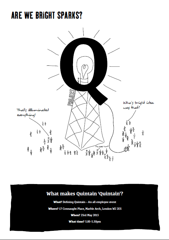
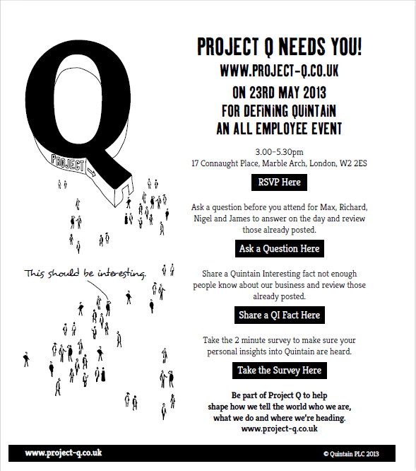
Post financial crisis, Quintain changed strategy to focus on their London developments Wembley Park and Greenwich Peninsular. To support the strategy, they needed to reposition their brand to communicate both their strength and new direction, to investor audiences and employees.

Working with Philosophy, I gathered insights from internal audiences on what makes Quintain Quintain, interviewing the CEO and divisional leads, as well as masterplanners, architects and project managers involved in Quintain’s mixed used developments. A key part of the process was an employee engagement workshop, a whole day event that involved all 130 Quintain employees in the brand definition process.

The core purpose we developed for the brand was ‘Creating London’. This was a simple capturing of the geographical focus for business going forward but also the skill, love and imagination that Quintain, with its partners, puts into its developments. I captured this purpose in a brand narrative also incorporating vision, mission and values.

Working with Philosophy Design

qu_2.png
qu_1.png
qu_3.png
SearchAcumen_Logo.png
 

Distinguishing the service around a commodity product

Search Acumen complete property searches for conveyancers, informing individuals and businesses about the property they’re purchasing. The leaders of the business had been in the industry for over two decades and were committed to using new technology to make the search process even better for customers.

The challenge was communicating the difference Search Acumen make in a commoditised industry where all suppliers have access to the same data. Working with MGA, I developed a brand template that included vision, mission and values and the customer value proposition ‘essential data, simply delivered’.

This statement expressed the key benefit to customers who could expect a hassle-free service from Search Acumen. It also worked as a call to action for employees to find the simplest way of doing everything for customers. The strapline I developed, Thinking Ahead, voiced Search Acumen’s commitment to always being ahead of the game in finding the best ways to deliver essential data – simply – to customers.

Working with MGA

SA-brand-3.png
acumen 1.png
lhc logo.png
 

Capturing the brand offer, simplifying language

LHC designs procurement frameworks that help local authorities, social landlords and other public sector bodies procure products and services for the construction, refurbishment and maintenance of social housing and public buildings.

In collaboration with Philosophy, I developed the brand strategy to enable clearer communication of LHC’s offer and redesign of their visual identity. Prior communication from LHC had got lost in the technical language of procurement frameworks. I concentrated on helping them to use every day language to explain what they do and who they benefit.

This included development of a strapline that encapsulated LHC’s offer and the positive outcomes they deliver to end users: Trusted procurement for better buildings and homes.

The brand strategy enabled a complete modernisation of LHC’s visual identity which for launch was rolled out across the company website, marketing documents and the annual review.

I wrote the website copy, edited marketing documents for each framework and went on to support the copy writing of LHC’s annual review.

Working with Philosophy Design

Quintain 4.png
LHC_2.png
LHC_5.png
LHC_4.png
 
essentra logo.png
 

Survey branding, assessing engagement

Essentra had grown rapidly through acquisition and implemented several key strategies to support their company vision, including a new organisational structure and global rebranding. As they continued to integrate operations and align their global people strategies they needed to understand employee perceptions of the business.

They commissioned Employee Feedback to deliver an engagement survey that assessed whether employees were motivated to do their job well and had everything they needed to do their job well. As the associate responsible for branding and communications, I was responsible for developing the survey brand, producing the campaign strategy, writing the full campaign, and project managing translation of all campaign items into 20 different languages.

I created the name Enable which expressed how the purpose of the survey was ensuring employees were motivated and supported to do their job well. Poster headlines played on Essentra’s role as a supplier of essential components. We asked what part can Essentra play in employees’ success. 81% of employees participated in the survey in year one and campaign materials were updated and used for several years subsequently, ensuring Enable became a recognised and respected brand within the business.

Working with Employee Feedback

es1a.png
es3a.png
es4a.png
 
office depor.png
 

Rethinking an offer, engaging sales teams

Office Depot is a well-recognised brand amongst consumer and business audiences, largely known for selling stationery supplies. The company in fact operates across five different categories and offers a far wider range of workplace materials than most people realise. Nonetheless they operate in a commodity market with increased competition from non-traditional suppliers.

I worked with Office Depot as part of the MGA team and was commissioned to I was commissioned to convert Office Depot’s customer value proposition, written in conventional business language, into an engaging idea that businesses of all kinds and sizes would connect with. It had to be a message that enabled explanation of the broad range of benefits Office Depot provides to customers, on top of delivering stationery.

The multiple strands within the customer value proposition were challenging to capture in simple form, so MGA and I developed a core message of “we’re changing the conversation”. This umbrella theme enabled Office Depot to talk about a range of things to customers, while attracting attention by suggesting Office Depot had something new
and different to say compared to the competition.

One of the first pieces of communication we produced under this theme was a sales engagement book which explained to sales teams their role in changing the conversation. It began with the headline statement “How to sell Office Depot and not just the pen”, a simple expression of the wider range of goods and services sales people had to communicate.

Working with MGA

od 1.png
od 2.png
od 3.png
 

Interested in working together?


Your Wise Creative

Katriina Cooper

kcooper@yourwisecreative.com