Chime
Visual brand by Fresh Lemon
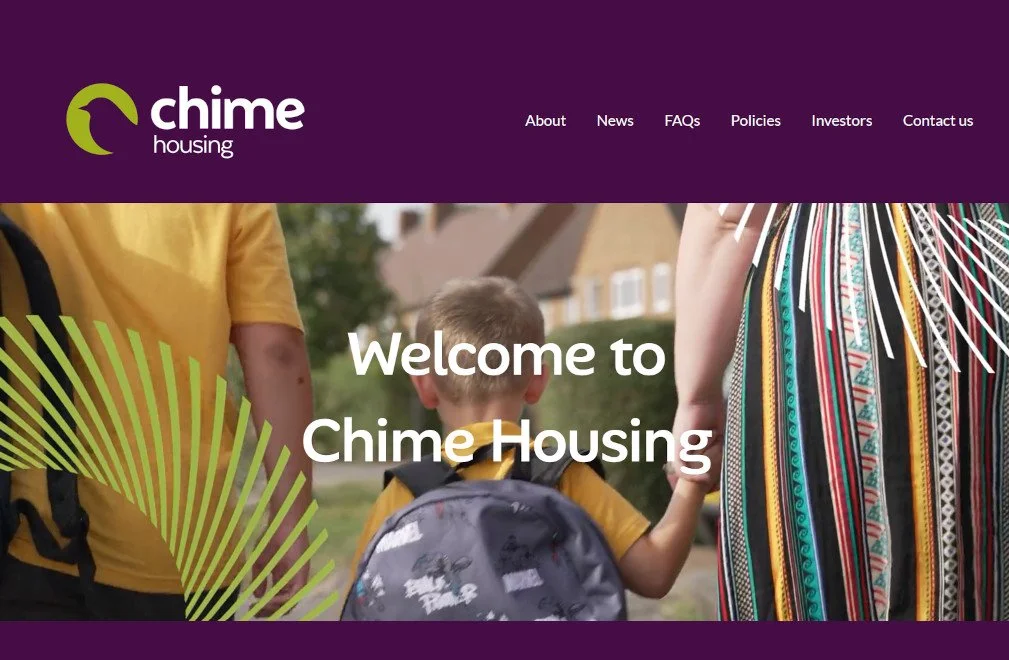
When Thrive Homes and Watford Community Housing announced a potential merger, they sought out a creative partner to develop a fresh and distinctive brand, reflective of the new housing association’s values, purpose and ambitions.
The challenge involved finding a new name; one capable of resonating with all residents (tenants, leaseholders and shared owners), as well as government stakeholders, sector partners and colleagues across both organisations.
In close collaboration with property marketing specialists Fresh Lemon, an extensive consultation process took place, with challenges, expectations and ambitions all unravelled, to understand how to name and position the new housing association for a successful future. A critical element was recognising the housing association’s legal status as a Community Gateway organisation – an entity that involves residents in decision-making.
The naming process built on our research findings and a set of key messages held within the new brand story. It involved several rounds of development and extensive searches to achieve a shortlist and final name that had the right tone and rationale and passed the necessary legal checks.
With the name in place, a 50 second animation was produced, which captured why the merger was taking place and why Chime was the right name. The shared values of both organisations and alignment with residents’ needs both came to the fore. A chime is also the collective term for a group of wrens – why is why the bird icon is used within the logo. Wrens are commonly found in Hertfordshire where both organisations were established.
Project role
Research
Core positioning
Brand story
Naming
Animation script writing